
Building Developers Portfolio with Astro
May 2026
9 min read
Why rebuild from scratch
My old Gatsby portfolio did its job but left a lot of me out. It showed projects but nothing about who I am outside the desk — no travel writing, no live activity widgets, no real personality. I wanted something that felt personal and professional at the same time, not just a résumé dressed in CSS.
The scope I had in mind was bigger than a static site. I wanted live widgets pulling from Strava, Spotify, GitHub, Steam, and Trakt. A contact form with real validation. A gallery. Journals. Tech blogs. This wasn’t a weekend project.
Why Astro over Gatsby
My old portfolio was built on Gatsby. It covered most of my needs well — optimized images, page generation from markdown, and a filesystem crawler that could turn any asset into a queryable node. The catch was GraphQL. To pull a markdown file or an image, you’d write a query, shape the response, and understand the data layer. That’s meaningful overhead for what is essentially a file import.
Astro flips the model. You just import what you need:
const heroMods = import.meta.glob(
  '/src/content/journals/**/images/*.{jpg,jpeg,png,webp}',
  { eager: true }
)
No schema. No query language. Just JavaScript module resolution. For a portfolio that’s mostly static content with a few reactive islands, this is the right abstraction level.
I also looked at Next.js, Nuxt, and SvelteKit. All capable, but they assume more JavaScript than a portfolio needs. Astro ships zero JS by default and you opt into client-side code per component — the opposite of every other framework’s default.
Component Islands: the key architecture decision
Astro’s island architecture is what made this work cleanly. The page is static HTML by default. Any component that needs interactivity gets a client: directive:
<GalleryPreview images={images} client:visible />
<SpotifyWidget client:idle />
client:visible hydrates when the component enters the viewport. client:idle hydrates when the browser is idle. For a portfolio where most content is read-only, this lets you ship almost no JavaScript while keeping the dynamic parts alive.
One thing that bit me: client:only="react" is not the same as client:visible. For packages that are framework-specific — I ran into this with react-pdf — you have to specify client:only="react" because the package assumes a React runtime and cannot render on the server at all. Using client:visible on a React-only package will throw during SSR. The directive isn’t just about when to hydrate, it’s also about which runtime the package requires.
Design system first
Before writing a single page, I defined the design tokens: font family, color palette, type scale, spacing scale, z-index ladder, and component variants. Everything in the UI traces back to a token rather than an arbitrary value.
This was worth the upfront cost. Consistent spacing and typography across ten-plus sections without hunting for magic numbers later.
The component library I built: Typography, Button, Badge, Tag, Alert, Toast, Card, Divider, Tooltip, Avatar, CodeBlock, TextField, TextArea, Tabs, Stepper, NavBar, MobileNav, SectionHeader. Each enforces the token system — <Typography variant="h3"> gives you the right size, weight, tracking, and line-height in one prop, not four Tailwind classes you might get inconsistent later.
Voice and tone was part of the design system too, not just the visuals. The copy across sections follows a defined personality — direct, lowercase-leaning, personal without being oversharing.
Folder structure: components vs modules
One decision that paid off early was separating shared components from page-specific sections.
src/
├── components/ui/      ← shared primitives, used across multiple pages
├── modules/
│   ├── landing/        ← sections that only appear on the home page
│   ├── contact/        ← sections that only appear on /contact
│   └── gallery/        ← sections that only appear on /gallery
├── pages/              ← route containers only, no section markup
├── content/            ← markdown content collections (journals, techblogs)
├── lib/                ← utility functions (formatDate, readingTime)
└── assets/             ← images and static media
The rule is straightforward: if a section only ever appears on one page, it belongs in src/modules/<page>/. Promote it to src/components/ui/ only when a second page needs it. This keeps shared primitives generic and page sections focused.
src/pages/ contains only route files. No section markup lives there — just imports and layout wiring. A page file maps to a URL and nothing else.
The practical benefit: when you open src/modules/landing/, you see exactly the sections that make up the home page. When you open src/components/ui/, everything there is reusable by definition. No guessing where a section lives or whether changing it will break something elsewhere.
Static content vs live data
Two categories of content shaped the architecture differently.
Static — pulled from local markdown and JSON files at build time, zero runtime cost:
- Project showcase
- Course listing
- Journals
- Tech blogs
Live — pulled from external APIs at request time or on the client:
- GitHub contribution graph and recent activity
- Strava weekly mileage and run history
- Spotify now-playing and recently played
- Trakt movie and show watching history
- Steam games played
Each live widget is a self-contained island with its own data fetching. Each has different auth patterns (OAuth, API keys, public endpoints) and caching requirements — isolating them per component keeps the failure surface small.
The contact form: why three services
The contact form uses Supabase, Resend, and Turnstile. Each has a distinct role with no overlap.
Turnstile (Cloudflare) runs on form submit. It is anti-bot validation — prevents automated scripts from throttling the endpoint without adding captcha friction for real users.
Supabase tracks submitting IP addresses. Before processing a submission, it checks whether that IP has submitted within a cooldown window, blocking repeated entries from the same source. The secondary motivation: I wanted to learn Supabase. There is also a natural scaling path — a future guest book feature would reuse the same IP tracking and submission pattern without starting from scratch.
Resend handles actual email delivery. When a submission clears Turnstile and the IP check, Resend sends the contact details directly to my inbox.
Three services instead of one because each solves a different layer of the problem. Combining them would mean either giving up one guarantee or rebuilding the missing piece inside a service not designed for it.
Coding standards I enforced
A few non-negotiables that shaped the codebase:
- Astro
<Image />instead of raw<img>. Automatic WebP conversion, dimension inference, and layout-shift prevention at build time. - Mobile-first layouts. Every section is designed for the smallest screen first, then expanded with
sm:,md:,lg:breakpoints. - Business logic out of components. Data fetching lives in hooks (
useGetPersonalData,useGetProjectList). Components import the hook, destructure data, and render only. - Path aliases.
@/components/ui/Typographyinstead of../../../../components/ui/Typography. - Consistent commit format.
[feat] - short lowercase summaryenforced as a prefix convention across every commit.
Working with AI
I want to be specific about what I built versus what AI helped with, because they are not the same thing.
My decisions:
- What content to include and why — work history, hobby widgets, journals, tech blogs
- Which tech stack to use and the reasoning behind each choice
- Folder structure and architectural patterns — content collections, modules versus components, hook-per-data-source
- Which design tokens to define and what the visual language should feel like
- Which sections needed external APIs versus local static files
AI-assisted:
- Design system review — contrast audits, WCAG compliance checks, animation restrictions for
prefers-reduced-motion - Tech stack research — reading and explaining documentation while I formed my own opinions
- Content analysis — reviewing UX feel, aligning copy to the voice and tone I had already defined
Heavily AI-executed:
- Code that follows the structures and standards I defined
- Prettier and lint automation setup
- Commit message formatting automation
- Code execution for planned section layouts
The distinction matters. AI moved fast on the execution layer. The direction — what to build, why, and how it should feel — was mine.
Performance: 100 across the board
The architecture decisions above weren’t just about code quality — they directly produced the performance numbers. Running PageSpeed Insights against the live site returns perfect scores on both desktop and mobile:
| Metric | Desktop | Mobile |
|---|---|---|
| Performance | 100 | 100 |
| Accessibility | 100 | 100 |
| Best Practices | 100 | 100 |
| SEO | 100 | 100 |
These aren’t tuned benchmarks — they’re the natural outcome of shipping zero JavaScript by default, using Astro’s <Image /> for all images (WebP conversion, lazy loading, no layout shift), and keeping every interactive island as small as possible.
The 100 accessibility score comes from semantic HTML, correct heading hierarchy, and ARIA labels on every interactive element. The 100 SEO score comes from the work described in the next section.
SEO and digital visibility
A portfolio is useless if no one can find it. The SEO layer wasn’t an afterthought — it was part of the same discipline as the performance work.
Meta and social tags. Every page includes a full Open Graph block (type, URL, title, description, locale) and a Twitter Card. This means links shared on LinkedIn, Slack, or X render with a proper preview instead of a bare URL. The <BaseLayout> component handles this for every route automatically — no per-page boilerplate.
Favicon set. A complete favicon suite: SVG for modern browsers, 96×96 PNG, .ico for legacy support, and a 180×180 Apple touch icon, plus a site.webmanifest for installability. Every target environment has the right format.
Crawlability. A robots.txt allows full indexing, and a sitemap is submitted directly to Google Search Console. After submission and allowing indexing through Search Console, the site started appearing in search results within days.
Proof it worked. Searching “Dahn Registrado” on Google returns dahnregistrado.dev as one of the top results — verified alongside the LinkedIn profile:
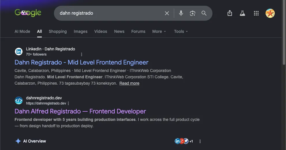
Getting indexed quickly required submitting the sitemap through Search Console rather than waiting for organic crawling. The combination of fast load times, clean semantic HTML, and complete meta tags meant the site passed Core Web Vitals on the first inspection.
What I would tell myself at the start
Define your design tokens before writing a single component. Sketch the folder structure before writing a single file. The hour spent on those decisions saves ten hours of inconsistent CSS and confusing imports later.
Pick a stack that matches your content model, not one that looks impressive in a README. Astro was right for this portfolio because most of it is static. If most of it were interactive, the answer would be different.
Don’t skip the SEO and performance layer. A portfolio that scores 100 on PageSpeed and shows up in search is doing real work. The architecture that gets you there is the same architecture that makes the codebase maintainable — clean separation, minimal JavaScript, semantic HTML. These things compound.